If you’re working with spreadsheets daily, learning how to analyze Excel data efficiently can save hours of manual work. In this guide, we’ll walk through how to analyze Excel data using DataLumio, turning raw files into structured insights in minutes.
Why Traditional Excel Analysis Falls Short
Excel is powerful—but when datasets grow, problems appear:
- Manual cleaning takes time
- Formulas become complex
- Insights are hard to extract
- Visualization requires effort
- Errors are common
This is where AI-powered analysis changes the game.
What is DataLumio?
DataLumio is an AI-powered data analysis platform that:
- Cleans messy datasets automatically
- Detects patterns and trends
- Generates insights instantly
- Creates dashboards and reports
- Works with Excel, CSV, and structured data
Instead of spending hours in Excel, you upload your file and let AI do the heavy lifting.
Step-by-Step: How to Analyze Excel Data Using DataLumio
Step 1: Upload Your Excel File
Start by uploading your .xlsx or .csv file into DataLumio.
Example data:
- Sales records
- Survey data
- Financial reports
- Inventory sheets
Once uploaded, DataLumio scans your dataset structure.
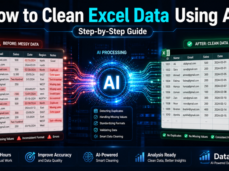
Step 2: Automatic Data Cleaning
DataLumio instantly cleans your dataset by:
- Removing duplicates
- Handling missing values
- Standardizing formats
- Detecting inconsistencies
This step alone can save hours of manual work in Excel.
Step 3: AI-Powered Data Analysis
After cleaning, DataLumio analyzes your data automatically:
- Identifies trends
- Detects patterns
- Calculates key metrics
- Segments data intelligently
Example:
- Top-performing products
- Customer satisfaction trends
- Revenue growth patterns
Step 4: Generate Insights & Reports
DataLumio converts your dataset into clear insights:
- Key findings summary
- Actionable recommendations
- Structured reports
- Downloadable documents
No formulas required.
Step 5: Visualize Your Data
Turn your Excel data into visuals:
- Charts
- Graphs
- Dashboards
- Trend lines
This helps you communicate insights effectively.
Example Use Cases
1. Business Data Analysis
Analyze sales, revenue, and customer trends.
2. Survey Data Analysis
Understand feedback, satisfaction, and sentiment.
3. Financial Analysis
Track expenses, profit margins, and growth.
4. Inventory Management
Monitor stock levels and optimize operations.
Benefits of Using DataLumio
✔ Saves hours of manual work
✔ Reduces human error
✔ Generates instant insights
✔ Works without coding
✔ Scales for large datasets
Best Practices for Excel Data Analysis
- Keep data structured (columns, rows clearly defined)
- Avoid merged cells
- Use consistent formats
- Remove unnecessary columns
- Validate your data before uploading
Final Thoughts
Learning how to analyze Excel data doesn’t have to be complicated. With AI tools like DataLumio, you can transform raw spreadsheets into powerful insights without manual effort.
If you regularly work with Excel files, switching to AI-powered analysis will improve accuracy, speed, and decision-making.