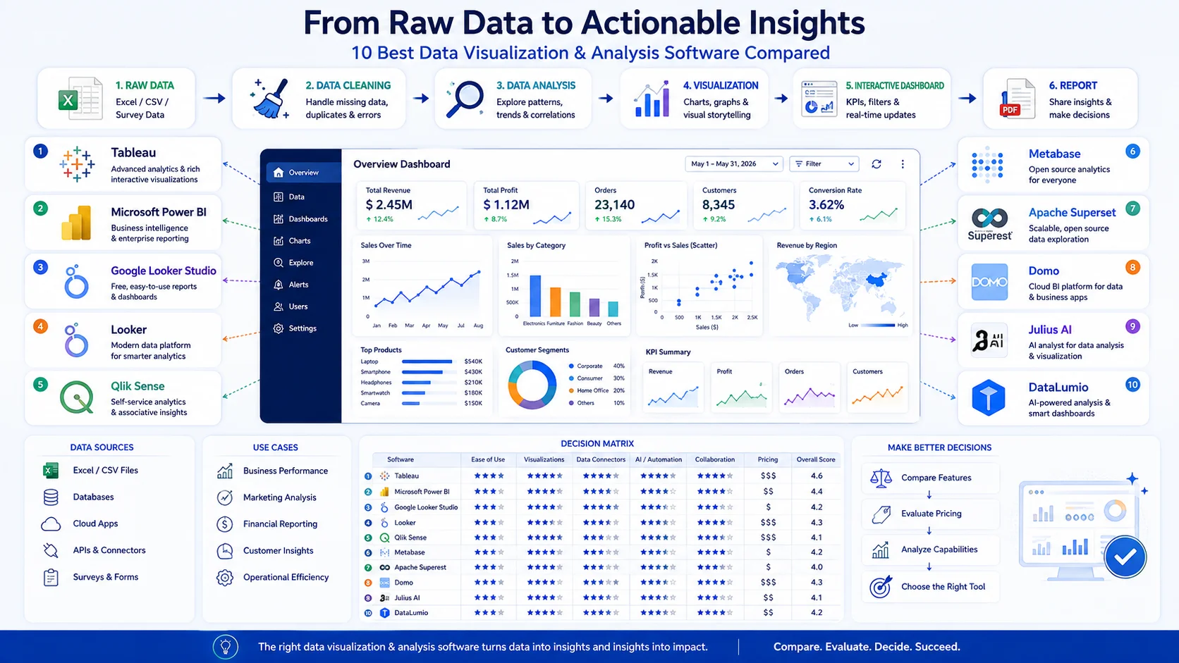
Choosing data visualization software is not really about finding the tool with the most charts.
The better question is: Which platform fits the data you have, the analysis you need to perform, the people who will use the results, and the level of technical complexity you can manage?
A research analyst working with survey data may need something very different from an enterprise BI team managing governed dashboards across a large organization. Likewise, someone who simply wants to turn an Excel or CSV file into useful charts may not need a full business-intelligence platform.
In this guide, we compare 10 data visualization software platforms across those practical differences—including dashboards, data analysis, no-code workflows, research use cases, technical complexity, data sources, and typical strengths and limitations.
Quick answer: There is no single best data visualization software for everyone. Tableau is a strong choice for advanced visual analytics, Power BI for Microsoft-centric business intelligence, Looker Studio for accessible Google-based reporting, Qlik Sense for interactive associative analytics, Metabase for approachable self-service analytics, Apache Superset for open-source data exploration, Domo for integrated enterprise analytics, Julius for conversational analysis and visualization, and DataLumio for users who want an accessible workflow that combines data cleaning, analysis, visualization, dashboards, and reporting.
The recommendations below are fit-based rather than an absolute ranking. Product capabilities and pricing can change, so verify current details with each vendor before making a purchasing decision.
Best Data Visualization Software at a Glance
If you need a quick starting point, this table summarizes where each platform fits best.
| Software | Best suited for | Technical level | Visualization | Data analysis | Dashboard focus | Best reason to consider it |
|---|---|---|---|---|---|---|
| Tableau | Advanced visual analytics | Intermediate–Advanced | Excellent | Strong | Excellent | Deep visual exploration |
| Microsoft Power BI | Business intelligence | Intermediate | Excellent | Strong | Excellent | Microsoft ecosystem and BI |
| Looker Studio | Accessible cloud reporting | Beginner–Intermediate | Strong | Moderate | Strong | Simple Google-oriented reporting |
| Looker | Governed analytics | Advanced | Strong | Strong | Strong | Semantic modeling and governed analytics |
| Qlik Sense | Interactive data exploration | Intermediate–Advanced | Excellent | Strong | Excellent | Associative exploration |
| Metabase | Self-service analytics | Beginner–Intermediate | Strong | Strong | Strong | Easy exploration and dashboards |
| Apache Superset | Open-source visualization | Intermediate–Advanced | Strong | Strong | Strong | Flexible open-source platform |
| Domo | Enterprise analytics | Intermediate–Advanced | Strong | Strong | Excellent | Connected data and business workflows |
| Julius | Conversational analysis | Beginner–Intermediate | Strong | Strong | Moderate | Ask questions and generate visualizations |
| DataLumio | No-code analysis + visualization | Beginner–Intermediate | Strong | Strong | Strong | Connected cleaning, analysis, dashboards and reporting |
Important: “technical level” here is an editorial assessment of the typical learning and implementation demands—not a vendor-published difficulty rating.
What Is Data Visualization Software?
Data visualization software is software that helps users transform structured or semi-structured data into charts, graphs, dashboards, maps, and other visual representations that make patterns, comparisons, trends, and relationships easier to understand.
Modern platforms increasingly combine visualization with data preparation, analysis, dashboarding, collaboration, reporting, and business intelligence.
For example, Microsoft describes Power BI visuals as components that transform curated data and calculations into insights about patterns, trends, and relationships.
Qlik similarly positions visualizations as tools for interpreting and exploring data, with interactive charts, filters, selections, and dashboards.
This distinction matters because visualization software and business intelligence software are not always the same thing.
A visualization-focused workflow might be:
CSV → chart → interpretation
A broader analytics workflow could be:
Raw data → cleaning → transformation → analysis → visualization → dashboard → reporting → decision
The second workflow requires considerably more than chart creation.
What Makes Good Data Visualization Software?
The best data visualization software should make it easier to answer questions—not simply make data look attractive.
When evaluating a platform, consider these factors:
1. Ease of use
Can a beginner create a useful visualization without learning SQL, DAX, scripting, or complicated data modeling?
2. Data compatibility
Can it work with the files and data sources you actually use?
For example:
- Excel
- CSV
- TSV
- Google Sheets
- SQL databases
- Cloud data warehouses
- APIs
- Research datasets
3. Visualization quality
Look beyond the number of chart types.
A useful platform should help you choose an appropriate visualization for the analytical question.
4. Interactivity
Filtering, drill-downs, cross-highlighting, selections, and interactive dashboards can turn a static chart into an exploration tool.
5. Analytical capability
Some platforms primarily visualize prepared data. Others also provide statistical analysis, transformations, calculations, or conversational analysis.
6. Data preparation
If your data arrives messy, visualization is only one part of the problem.
You may need:
- duplicate detection
- missing-value handling
- filtering
- restructuring
- type correction
- aggregation
- transformation
7. Dashboard capabilities
A dashboard should help users monitor or explore several related metrics without becoming an overloaded collection of charts.
8. Collaboration and sharing
Consider whether dashboards need to be shared internally, embedded externally, exported, scheduled, or presented to clients.
9. Governance and security
Enterprise users may need permissions, controlled definitions, data governance, authentication, and centralized administration.
10. Total complexity
A platform can be extremely powerful and still be the wrong choice if your team does not need its complexity.
The 10 Best Data Visualization Software Tools in 2026
1. Tableau — Best for Advanced Visual Analytics
Best for: Analysts, organizations, and teams that need sophisticated interactive visual analytics.
Tableau remains one of the most recognizable names in data visualization because its core strength is visual exploration.
It is particularly suitable when users need to move beyond static charts and interactively investigate relationships, trends, categories, and other dimensions of a dataset.
Why consider Tableau?
Tableau makes sense when visualization itself is a major part of the analytical workflow.
It is a strong candidate for:
- Advanced dashboards
- Interactive business analytics
- Data storytelling
- Exploratory visualization
- Complex organizational reporting
- Analysts who need substantial visualization flexibility
Strengths
- Strong visual analytics
- Sophisticated dashboards
- Extensive visualization capabilities
- Suitable for advanced analytical workflows
- Strong ecosystem around business analytics
Potential limitations
Its power can also create a learning curve.
If your requirement is simply:
“I have a spreadsheet and want several useful charts quickly.”
then a full enterprise visualization environment may be more capability than you actually need.
Best fit: Users who prioritize analytical depth and visualization flexibility over simplicity.
2. Microsoft Power BI — Best for Microsoft-Centric Business Intelligence
Best for: Businesses already invested in Microsoft technologies and teams that need comprehensive BI.
Power BI combines reporting, dashboards, data modeling, calculations, interactive visuals, and increasingly AI-assisted functionality.
Microsoft’s current documentation includes report creation, visuals, filters, formatting, dashboards, samples, and Copilot-related workflows.
Power BI visuals support interactive behavior such as cross-filtering and cross-highlighting, while reports can support drill-through and deeper exploration.
Why consider Power BI?
It is particularly compelling when visualization is only one component of a broader business intelligence environment.
Typical applications include:
- Sales dashboards
- Financial reporting
- Operations analytics
- Marketing analytics
- Management reporting
- KPI monitoring
- Enterprise BI
Strengths
- Strong dashboard functionality
- Extensive business intelligence capabilities
- Powerful data modeling
- Interactive visualizations
- Strong Microsoft ecosystem fit
- Suitable for organizations with established BI workflows
Potential limitations
Power BI can be more complex than a lightweight visualization tool.
Users may encounter concepts such as:
- Data models
- Measures
- DAX
- Power Query
- Relationships
- Semantic models
Those capabilities are useful, but they also increase the learning requirements.
Best fit: Organizations that want visualization as part of a broader BI system.
3. Google Looker Studio — Best for Accessible Cloud Reporting
Best for: Users who want straightforward online reporting and dashboard creation, particularly around Google-oriented data workflows.
Looker Studio is often considered when accessibility and cloud-based reporting matter more than highly sophisticated enterprise analytics.
It can be a practical choice for:
- Marketing reports
- Website analytics
- Campaign reporting
- Shared dashboards
- Small teams
- Lightweight business reporting
Strengths
- Accessible reporting workflow
- Cloud-oriented experience
- Useful for dashboard sharing
- Familiar option for users working extensively with Google data products
Potential limitations
Organizations requiring advanced enterprise modeling, sophisticated governance, or very complex analytics may need a more comprehensive platform.
Best fit: Users who want accessible cloud reporting without adopting a heavyweight BI environment.
4. Looker — Best for Governed Analytics and Semantic Modeling
Best for: Organizations that need centrally managed analytics definitions and governed data access.
Looker belongs in a different category from simple charting tools.
Its value is not only the visual layer. The platform is designed around governed analytics and reusable definitions of business metrics.
That can be important in organizations where different departments otherwise calculate the same metric differently.
For example, consider the definition of:
“Monthly active customer”
If sales, finance, product, and marketing each calculate it differently, having attractive dashboards does not solve the underlying problem.
Strengths
- Governed analytics
- Strong semantic-modeling orientation
- Enterprise reporting
- Reusable business definitions
- Suitable for centralized analytics environments
Potential limitations
Looker can be excessive for an individual researcher or small business that simply needs to visualize a CSV file.
Best fit: Organizations where data governance and consistent analytical definitions matter as much as visualization.
5. Qlik Sense — Best for Interactive Data Exploration
Best for: Analysts and organizations that want interactive exploration across connected datasets.
Qlik Sense emphasizes interactive data discovery. Its documentation describes applications containing data and visualizations that users can interact with to make discoveries, while its associative model allows selections to influence related visualizations.
Its visualization environment includes charts, tables, filters, dashboards, and analysis-oriented functionality.
Why Qlik is different
Qlik is particularly interesting when the goal isn’t simply:
“Show me this KPI.”
but:
“Let me explore the relationships in this data and see what changes when I make different selections.”
Strengths
- Interactive exploration
- Strong visualization capabilities
- Associative analytics
- Dashboarding
- Data discovery
Potential limitations
Advanced Qlik environments can require more analytical and modeling knowledge than simple no-code tools.
Best fit: Analysts who need interactive exploration rather than only static reporting.
6. Metabase — Best for Accessible Self-Service Analytics
Best for: Teams that want non-technical users to explore data and create dashboards without relying entirely on analysts or developers.
Metabase positions itself around making data exploration accessible, including a visual query builder that reduces the need for SQL for common analytical tasks. It also provides interactive dashboards, visualizations, and sharing capabilities.
Its dashboard system supports charts, tables, filters, interactive behavior, subscriptions, and actions.
Why consider Metabase?
Metabase is attractive when a company already has data in databases and wants more people to explore it.
For example:
Database → Metabase → visual query → chart → dashboard
That is different from a spreadsheet-first workflow.
Strengths
- Approachable interface
- Visual query builder
- SQL available for advanced users
- Interactive dashboards
- Sharing and embedding
- Strong self-service orientation
Potential limitation
If your primary input is an individual research spreadsheet rather than a connected database, a file-oriented analysis tool may be a better fit.
Best fit: Organizations that want accessible self-service analytics on top of existing data infrastructure.
7. Apache Superset — Best Open-Source Option for Data Exploration
Best for: Technical teams looking for an open-source data exploration and visualization platform.
Apache Superset describes itself as an open-source modern data exploration and visualization platform. It supports both a no-code visualization builder and SQL-based workflows, along with dashboards and a wide range of visualization types.
Superset is especially relevant for organizations that already have database infrastructure and technical resources.
Its documentation describes a workflow where analysts connect Superset to an existing SQL-speaking database, explore the exposed data, and build visualizations and dashboards.
Strengths
- Open-source
- Data exploration
- Dashboard creation
- SQL support
- No-code chart building
- Large visualization selection
- Works with SQL-based databases
Potential limitations
Open-source does not automatically mean “easy.”
Deployment, administration, database connectivity, authentication, maintenance, and customization can require technical expertise.
Best fit: Technical organizations that want flexibility and control over their analytics stack.
8. Domo — Best for Integrated Enterprise Data and Dashboards
Best for: Organizations looking for a broader platform combining data integration, visualization, analytics, and business workflows.
Domo positions its platform around connecting data, preparing and transforming it, visualizing and sharing insights, and supporting AI-powered workflows. It also offers interactive dashboards, no-code analytics tools, and embedded analytics.
Why consider Domo?
Domo becomes interesting when the problem is larger than chart creation.
A typical enterprise workflow may involve:
Connect → prepare → analyze → visualize → share → act
That broader scope can reduce the need to assemble several disconnected tools.
Strengths
- Enterprise-oriented analytics
- Data integration
- Interactive dashboards
- Data preparation
- No-code analytics
- Embedded analytics
- Broader business workflows
Potential limitations
A broad enterprise platform may be unnecessary for an individual researcher or small team with a handful of spreadsheets.
Best fit: Organizations that need an integrated enterprise analytics environment.
9. Julius — Best for Conversational Data Analysis and Visualization
Best for: Users who want to interact with data through natural-language questions while generating charts and analytical outputs.
Julius takes a different approach from traditional BI software.
Its official product material describes workflows involving uploaded files, data manipulation, visualization, insights, and automatically generated notebooks. It also says users can add files and generate graphs and charts.
Why consider Julius?
For some users, the challenge isn’t knowing which button creates a chart.
The challenge is knowing:
“What should I ask the data?”
Conversational interfaces can reduce some of that friction.
Strengths
- Conversational analysis
- Data visualization
- Data manipulation
- File-oriented workflows
- Automated analytical workflows
- Useful for users who prefer natural-language interaction
Potential limitations
Conversational analysis should not eliminate validation.
When results affect academic research, finance, business decisions, or other consequential work, users still need to inspect the underlying data, assumptions, calculations, and visualizations.
Best fit: Users who want analysis and visualization through a conversational workflow.
10. DataLumio — Best for No-Code Data Analysis and Visualization in One Workflow
Best for: Researchers, students, analysts, consultants, business professionals, and other users who want to move from raw files to analysis, dashboards, and reports without setting up a complex BI environment.
DataLumio takes a workflow-oriented approach.
Instead of treating visualization as an isolated activity, it connects:
Upload → Clean → Analyze → Visualize → Dashboard → Report
Its current Features page describes workflows for uploading files, cleaning datasets, performing qualitative or quantitative analysis, creating interactive dashboards, analyzing PDFs, and generating reports.
For dashboard visualization specifically, DataLumio supports CSV, XLSX, XLS, and TSV files and provides dashboard styles including Executive Overview, Statistical Deep Dive, Time Series Focus, Group Comparison, and AI Smart Mix.
Why consider DataLumio?
The distinction is important.
If you already have a clean database and need enterprise BI, a platform such as Power BI, Tableau, Looker, Qlik, or Domo may be a better fit.
But if your workflow begins with files such as:
- Survey data
- Research datasets
- Excel spreadsheets
- CSV exports
- Business reports
- Interview documents
- PDFs
then combining preparation, analysis, visualization, and reporting can be more practical than assembling separate tools.
Strengths
- No-code workflow
- Spreadsheet-oriented analysis
- CSV/XLSX/XLS/TSV visualization support
- Interactive dashboards
- Data cleaning
- Quantitative analysis
- Qualitative analysis
- PDF analysis
- Reporting
- Designed for researchers and non-technical users
DataLumio’s own documentation also explicitly notes that it is not a replacement for expert statistical judgment, particularly for formal academic or high-stakes work.
That limitation is important: automated analysis can accelerate the workflow, but it does not remove the need for human interpretation and validation.
Potential limitations
DataLumio is not positioned as a replacement for every enterprise BI architecture.
If your organization needs extensive data warehousing, sophisticated enterprise governance, large-scale database infrastructure, or deeply customized BI engineering, a specialized BI platform may be more appropriate.
Best fit: Users who prioritize an accessible, connected workflow from files and raw data through cleaning, analysis, visualization, dashboards, and reporting.
Which Data Visualization Software Is Best for Different Users?
The “best” tool changes depending on who is using it.
| User | Strong candidates | Why |
|---|---|---|
| Researcher | DataLumio, Julius, Tableau | File analysis, visualization, exploration |
| Student | DataLumio, Looker Studio, Julius | Lower barrier to entry |
| Data analyst | Tableau, Power BI, Qlik, Metabase | Deeper analysis and dashboards |
| Business analyst | Power BI, Tableau, Qlik, Domo | BI and reporting |
| Marketing professional | Looker Studio, Power BI, DataLumio | Reporting and accessible visualization |
| Small business | DataLumio, Metabase, Looker Studio | Simplicity and self-service |
| Enterprise BI team | Power BI, Tableau, Looker, Qlik, Domo | Governance and scale |
| Technical team | Superset, Metabase, Power BI | Database-centric analytics |
| Non-technical user | DataLumio, Looker Studio, Metabase, Julius | Lower technical barrier |
| Open-source advocate | Apache Superset | Open-source visualization platform |
These are fit recommendations, not universal rankings.
Which Data Visualization Software Is Easiest to Learn?
For a beginner, the easiest tool is usually the one that matches the user’s existing data and avoids unnecessary technical layers.
If you have a spreadsheet and simply want to create charts, a file-oriented or no-code platform may feel easier than an enterprise BI platform.
For example:
- DataLumio: useful when the workflow starts with files and also requires cleaning and analysis.
- Looker Studio: useful for accessible cloud reporting.
- Metabase: useful when data already lives in a connected database.
- Julius: useful when natural-language interaction is preferred.
By contrast, Power BI, Tableau, Qlik, Looker, and Superset can provide considerably deeper capabilities, but their broader functionality may introduce additional concepts and configuration.
The key lesson is:
Don’t confuse “most powerful” with “easiest to learn.”
What Is the Best Free Data Visualization Software?
There is no single answer because “free” can mean several different things.
It might mean:
- Free for individual use
- Free tier
- Open-source
- Free trial
- Free visualization but paid enterprise functionality
Apache Superset is explicitly an open-source data exploration and visualization platform.
Other vendors may offer free tiers, trials, or limited free functionality, but these conditions can change.
If cost is a deciding factor, check the vendor’s current pricing and licensing terms immediately before choosing.
Do not select software solely because the entry price is zero.
Also consider:
- Hosting
- Administration
- Data storage
- User seats
- Premium connectors
- Deployment
- Training
- Maintenance
- Enterprise features
The cheapest license can become the most expensive option if the implementation requires substantial technical effort.
Which Tools Work Best With Excel and CSV Files?
If your primary data source is Excel or CSV, the decision changes significantly.
A file-based workflow often looks like:
Excel/CSV → clean → analyze → visualize → report
DataLumio explicitly supports CSV, XLSX, and XLS for quantitative analysis and data cleaning, while its dashboard workflow supports CSV, XLSX, XLS, and TSV.
Power BI also documents workflows for creating reports from Excel.
The important question isn’t merely:
“Does the tool support Excel?”
Instead ask:
“What happens after I import Excel?”
Does the platform:
- Clean the data?
- Detect problems?
- Build relationships?
- Calculate metrics?
- Create charts?
- Generate dashboards?
- Explain results?
- Export reports?
That distinction can dramatically change which platform is best.
Which Tools Are Best for Dashboards?
For dashboard-heavy requirements, several platforms stand out, but for different reasons.
Enterprise dashboards
Consider:
- Power BI
- Tableau
- Qlik Sense
- Looker
- Domo
Self-service dashboards
Consider:
- Metabase
- Looker Studio
- Apache Superset
Metabase, for example, supports interactive dashboards, filters, dashboard actions, subscriptions, and sharing.
Superset provides dashboard creation, chart building, filters, and interactive exploration.
File-to-dashboard workflows
Consider:
- DataLumio
- Julius
DataLumio’s dashboard workflow is specifically designed around uploaded spreadsheet files and provides different dashboard styles for different analytical purposes.
Which Data Visualization Software Is Best for Researchers?
Researchers often have a different workflow from conventional business intelligence teams.
A research workflow may involve:
Survey responses → cleaning → descriptive analysis → statistical exploration → charts → findings → report
Or:
Interview transcripts → qualitative analysis → themes → evidence → visual summary → report
This means a researcher may need more than dashboard software.
For that reason, DataLumio and Julius can be particularly relevant for file-oriented research workflows, while Tableau, Power BI, and Qlik can become stronger candidates when researchers need advanced visualization and broader analytical environments.
DataLumio is designed to combine quantitative and qualitative workflows with visualization and reporting, while its documentation specifically identifies researchers and students as target users.
The right choice ultimately depends on the methodology.
For formal statistical research, always validate calculations, assumptions, data preparation, and interpretations independently.
Data Visualization Software vs. Business Intelligence Software
These terms overlap, but they are not interchangeable.
| Data visualization software | Business intelligence software |
|---|---|
| Focuses heavily on visual communication | Broader decision-support ecosystem |
| Charts and graphs are central | Modeling, reporting and governance may also be central |
| Often supports exploratory analysis | Often supports structured organizational analytics |
| Can work with files or prepared datasets | Frequently connects to organizational databases |
| Useful for communicating findings | Useful for recurring operational decisions |
There is substantial overlap.
Power BI, Tableau, Qlik, Looker, and Domo can all include visualization while functioning as broader analytics or BI platforms.
The distinction is therefore more useful as a continuum than as a strict category.
Tableau vs. Power BI: Which Is Better?
Neither is universally better.
Choose based on the problem.
Choose Tableau when:
- Visual exploration is a primary requirement.
- Analysts need sophisticated visualization capabilities.
- Interactive data storytelling is important.
- The organization values deep visual analytics.
Choose Power BI when:
- Your organization already uses Microsoft technologies extensively.
- You need broader BI functionality.
- Data modeling and business reporting are important.
- Your users need integrated dashboards and reports.
Microsoft’s documentation emphasizes reports, dashboards, interactive visuals, data models, and AI-assisted reporting capabilities.
Decision rule: If visualization sophistication is the dominant requirement, evaluate Tableau closely. If broader Microsoft-centric BI is the priority, evaluate Power BI closely.
But the best decision should come from testing representative data—not from brand recognition.
When Should You Use an AI-Assisted Data Visualization Tool?
AI-assisted visualization is most useful when the bottleneck is not merely chart rendering.
It can help when users need assistance with:
- Exploring unfamiliar datasets
- Generating initial visualizations
- Identifying possible trends
- Cleaning common data problems
- Asking questions in natural language
- Creating analytical summaries
- Moving from raw files toward a first-pass report
Julius, for example, describes workflows for manipulating data, generating visualizations, and obtaining analytical insights through an AI-oriented interface.
DataLumio similarly combines data cleaning, quantitative and qualitative data analysis, dashboards, PDF analysis, and reporting within one workflow.
But AI assistance should be treated as acceleration, not automatic correctness.
Before using AI-generated results in consequential work, check:
- Source data
- Calculations
- Missing values
- Outliers
- Statistical assumptions
- Chart selection
- Labels
- Units
- Interpretation
- Conclusions
How to Choose the Best Data Visualization Software
Instead of comparing dozens of feature checkboxes, use this six-step framework.
Step 1: Identify your starting data
Ask:
Where does my data live?
- Excel?
- CSV?
- Google Sheets?
- SQL database?
- Cloud warehouse?
- Survey platform?
- Research documents?
Your answer immediately eliminates some platforms.
Step 2: Identify your actual analytical task
Do you need to:
- Create charts?
- Explore patterns?
- Perform statistical analysis?
- Clean data?
- Build recurring dashboards?
- Analyze qualitative data?
- Generate reports?
- Monitor KPIs?
- Share results with clients?
A tool that only solves the visualization step may not be sufficient.
Step 3: Determine your technical level
Beginner
Prioritize:
- No-code workflows
- Templates
- Simple imports
- Guided analysis
- Automatic chart generation
Intermediate
Consider:
- Interactive dashboards
- Data modeling
- Calculated fields
- Advanced filters
- Database connections
Advanced
Prioritize:
- SQL
- Semantic modeling
- Governance
- APIs
- Custom visualizations
- Deployment flexibility
Step 4: Decide whether you need analysis or visualization only
This is one of the most important decisions.
If you already have clean, analyzed data, visualization software may be enough.
If you start with messy raw data, you may need:
Cleaning → analysis → visualization → reporting
In that case, an end-to-end platform can reduce tool switching.
Step 5: Consider scale and governance
Ask:
- How many users will access the system?
- Where is the data stored?
- Do you need permissions?
- Do dashboards need to be embedded?
- Is centralized metric governance required?
- Does your team have technical administrators?
The answers can push you toward enterprise BI platforms rather than lightweight tools.
Step 6: Test with your own representative dataset
This is more reliable than choosing based on marketing pages.
Use a real—but appropriately anonymized—sample dataset and measure:
- Import difficulty
- Cleaning effort
- Chart creation time
- Dashboard creation
- Analytical flexibility
- Export quality
- Sharing
- Learning curve
- Validation requirements
- Total cost
The best software is the one that performs well against your workflow, not someone else’s feature checklist.
A Practical Decision Tree
What do you need?
I mainly need enterprise BI.
→ Evaluate Power BI, Tableau, Looker, Qlik Sense, or Domo.
I need advanced visual analytics.
→ Start with Tableau and compare it with Power BI or Qlik Sense.
I need Microsoft-oriented business reporting.
→ Evaluate Power BI.
I need governed analytics and semantic modeling.
→ Evaluate Looker.
I want accessible self-service database analytics.
→ Consider Metabase.
I want an open-source visualization platform.
→ Consider Apache Superset. Its official documentation describes it as an open-source visualization and data exploration platform.
I want conversational data analysis.
→ Consider Julius.
I mainly work with research or spreadsheet files and want cleaning + analysis + dashboards + reporting in one workflow.
→ Consider DataLumio.
Common Mistakes When Choosing Visualization Software
Choosing the most powerful tool instead of the most suitable one
More features do not necessarily produce better results.
Comparing only chart counts
A platform with 100 chart types isn’t automatically better than one with 20 useful visualizations.
Ignoring data preparation
A beautiful dashboard cannot fix fundamentally incorrect or poorly prepared data.
Forgetting the audience
A technically sophisticated dashboard may be difficult for executives, clients, students, or research participants to understand.
Ignoring maintenance
Ask who will maintain:
- Data connections
- Calculations
- Dashboards
- Permissions
- Data models
- Definitions
Choosing based only on price
Include implementation, training, administration, and switching costs.
Trusting automated analysis without validation
AI-assisted tools can speed up exploration, but important conclusions still require human review.
What Are the Limitations of Data Visualization Software?
No visualization platform eliminates the underlying challenges of data analysis.
A dashboard can visualize incorrect data.
A sophisticated chart can communicate a misleading conclusion.
An automated analysis can misunderstand a variable.
A dashboard can also create false confidence if users don’t understand:
- Sampling
- Missing data
- Measurement error
- Confounding variables
- Statistical uncertainty
- Data definitions
- Aggregation effects
This is why visualization should be treated as part of an analytical process rather than a substitute for one.
A useful workflow is:
Understand the question → validate the data → analyze appropriately → choose the visualization → interpret cautiously → communicate the result
What Should You Check Before Buying Data Visualization Software?
Use this checklist before committing to a platform.
Data compatibility
- Does it support my actual file/database formats?
- Can it handle my expected data volume?
- Does it connect to the systems I already use?
Analysis
- Can it perform the analysis I need?
- Does it support calculated metrics?
- Can advanced users use SQL or other analytical methods where required?
Visualization
- Does it support the charts I actually need?
- Can users filter and explore dashboards?
- Are visualizations customizable?
Workflow
- Can I clean data before visualization?
- Can I move from analysis to reporting?
- Can I export or share results?
Usability
- Can my intended users learn it?
- Does it require coding?
- Will analysts or administrators be needed?
Governance
- Are permissions available?
- Can metrics be governed?
- Does it fit our security requirements?
Cost
- What is included?
- Are users charged by seat?
- Are connectors extra?
- Are enterprise features separate?
- What are implementation and maintenance costs?
Which Data Visualization Tool Should You Choose?
The right choice depends less on the word “best” and more on the phrase “best for what?”
If your priority is advanced visual analytics, Tableau deserves serious consideration.
If you need broad Microsoft-centric BI, Power BI is a natural candidate.
If you need accessible cloud reporting, consider Looker Studio.
If governed analytics and semantic modeling are central, evaluate Looker.
If interactive associative exploration is important, evaluate Qlik Sense.
If self-service database analytics is the goal, Metabase is worth considering.
If open-source flexibility is important, look at Apache Superset.
If you want integrated enterprise analytics and data workflows, evaluate Domo.
If you prefer conversational analysis, Julius offers a different approach.
And if your workflow begins with spreadsheets or research files and you want to combine cleaning, analysis, visualization, dashboards, and reporting without coding, DataLumio is a relevant option. Its documented workflow is explicitly designed to connect those steps.
Frequently Asked Questions
What is the best data visualization software in 2026?
There is no universally best platform. Tableau is a strong choice for advanced visual analytics, Power BI for Microsoft-centric BI, Qlik Sense for interactive exploration, Metabase for self-service analytics, Superset for open-source visualization, Julius for conversational analysis, and DataLumio for users seeking a connected no-code workflow from data files through analysis and dashboards.
What is the easiest data visualization software?
For beginners, tools with no-code or guided workflows are generally easier to approach. The best option depends on the starting data. DataLumio, Looker Studio, Metabase, and Julius can be attractive for different beginner-oriented workflows, while enterprise platforms such as Power BI, Tableau, Qlik, and Looker may require more learning.
What is the best free data visualization software?
The answer depends on what “free” means. Apache Superset is an open-source data exploration and visualization platform. Other products may offer free tiers or trials, but current terms should be checked directly with each vendor.
Which data visualization tools work with Excel?
Several major platforms support Excel-oriented workflows. Power BI, for example, provides official documentation for creating reports from Excel. DataLumio supports XLSX and XLS files for quantitative analysis, cleaning, and dashboard workflows.
Which data visualization tools work with CSV?
CSV is supported by many modern analytics platforms, but the important difference is what happens after import. DataLumio’s documented workflow supports CSV for data cleaning, quantitative analysis, and visualization dashboards.
Do data visualization tools require coding?
Not necessarily. Many platforms provide no-code or low-code interfaces. However, advanced workflows may involve SQL, formulas, data modeling, scripting, or other technical methods. Apache Superset, for example, offers both a no-code visualization builder and SQL-based functionality.
Can data visualization software analyze data too?
Yes. Many modern platforms combine visualization with analysis. Power BI includes data modeling and analytical functionality, Qlik supports analytics and exploration, Metabase provides querying capabilities, Julius combines analysis and visualization, and DataLumio connects quantitative analysis with dashboard visualization.
Is data visualization the same as business intelligence?
No. There is substantial overlap, but business intelligence generally encompasses a broader collection of activities such as data integration, modeling, reporting, governance, analysis, and decision support. Visualization is one important part of that ecosystem.
What should researchers look for in data visualization software?
Researchers should consider data-file support, statistical capabilities, reproducibility, visualization flexibility, data cleaning, export options, and whether the platform fits their research methodology. Automated outputs should be validated before being used as formal research findings.
Conclusion: Choose the Tool That Fits the Workflow
The best data visualization software isn’t necessarily the one with the largest feature list.
It is the platform that gets your team from data to a trustworthy decision with an appropriate level of effort.
For enterprise BI, look closely at platforms such as Power BI, Tableau, Looker, Qlik Sense, and Domo.
For self-service and open-source analytics, Metabase and Apache Superset are worth evaluating.
For conversational data work, Julius provides an alternative approach.
For users working primarily with research files and spreadsheets who want to connect data cleaning, quantitative or qualitative analysis, visualization, dashboards, and reporting, DataLumio is worth evaluating as an accessible alternative to a more complex BI stack.
The most reliable way to choose is to take a representative dataset, define the questions you need to answer, and test several platforms against the same workflow.
Don’t choose the software with the most features. Choose the software that solves your actual data problem well.
A practical next step
If your workflow starts with CSV or Excel files and you want to explore cleaning, analysis, dashboards, and reporting in one web-based environment, you can review the relevant DataLumio features before deciding whether it fits your needs.
Related Resources
- Google Search Central: Creating Helpful, Reliable, People-First Content
- Microsoft Power BI documentation
- Qlik Sense documentation
- Apache Superset
- Metabase
- Domo
- Julius AI visualization documentation
- DataLumio Features
Editorial disclosure: DataLumio publishes this comparison and is included as one of the products evaluated. Product descriptions are based on current first-party documentation, while recommendations represent editorial judgments about different user workflows. Readers should verify current pricing and capabilities with each vendor before purchasing.